Hey everyone! 👋  If you’re like me, you are diving into trying out all the various AI tools out there. And, there’s A TON of them. Most require some type of subscription, which starts to add up. Some free are free, like Adobe Firefly (AF),  Over the last two years, I’ve been learning and attempting to keep up with the creative landscape that is rapidly and ever-evolving.  So, today, I’m sharing what’s been helpful for me in generating unique text effects with Adobe Firefly and generally what I use it for. 

Quick Breakdown: If you’re looking for a thorough overview of the tool and its in-depth limitations check out this blog: https://www.pcmag.com/reviews/adobe-firefly# AF is a good free option if you are looking to create mood boards, reference images, singular (but nonspecific elements) you want to bring into another graphic to remix. Thus far, I haven’t been able to create the same realistic and useable images as in Midjourney. I’ve had to work with it for several rounds to get it to make what I’m looking for, “close-ish” enough. So, far this won’t be my go to tool for creating actual business images as it’s pretty time consuming compared to midjourney.  

Ok with that said, let’s have a little play and get use to the tool and how it functions.  

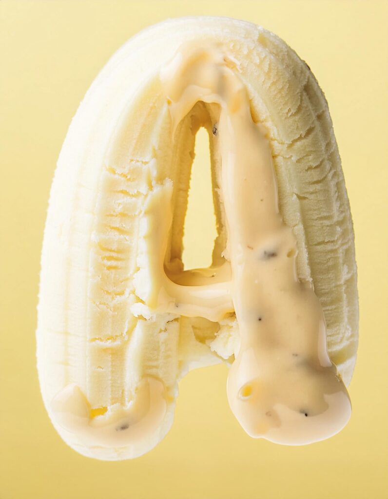
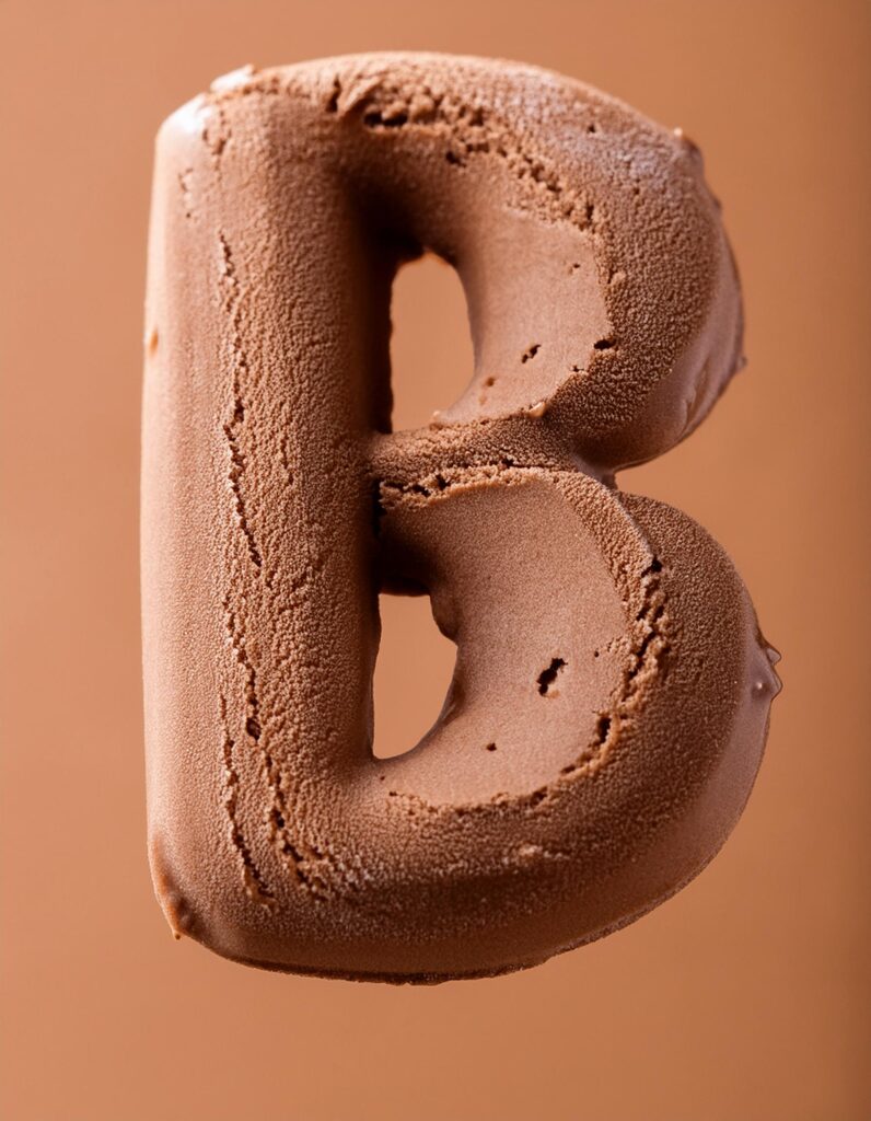
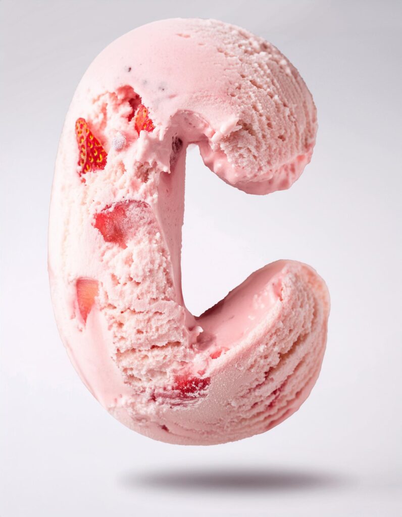
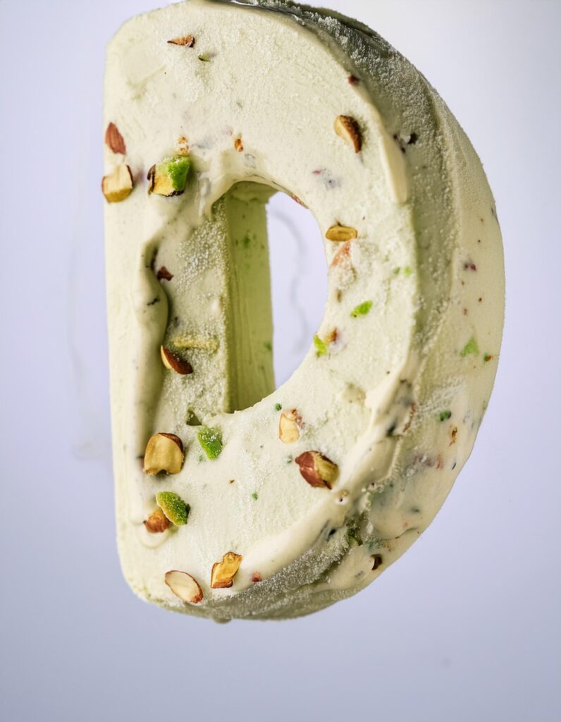
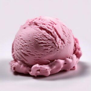
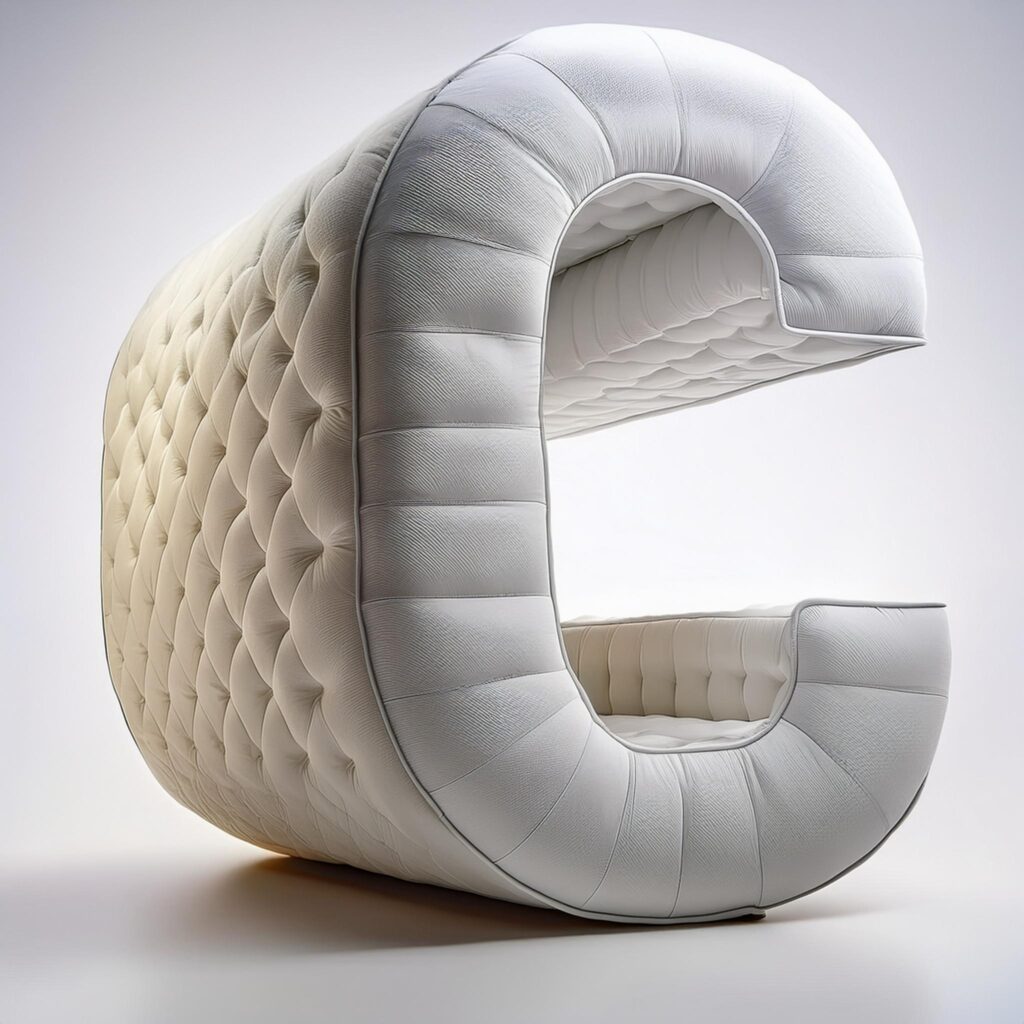
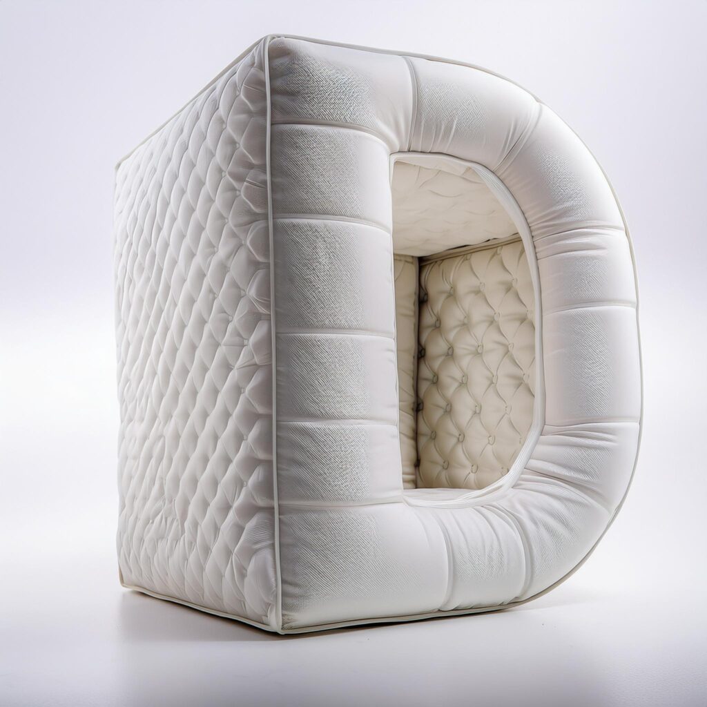
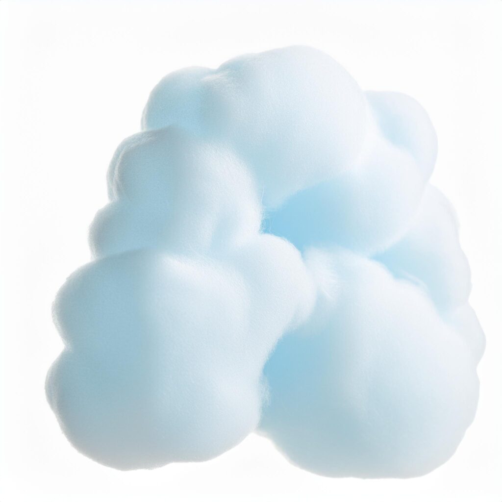
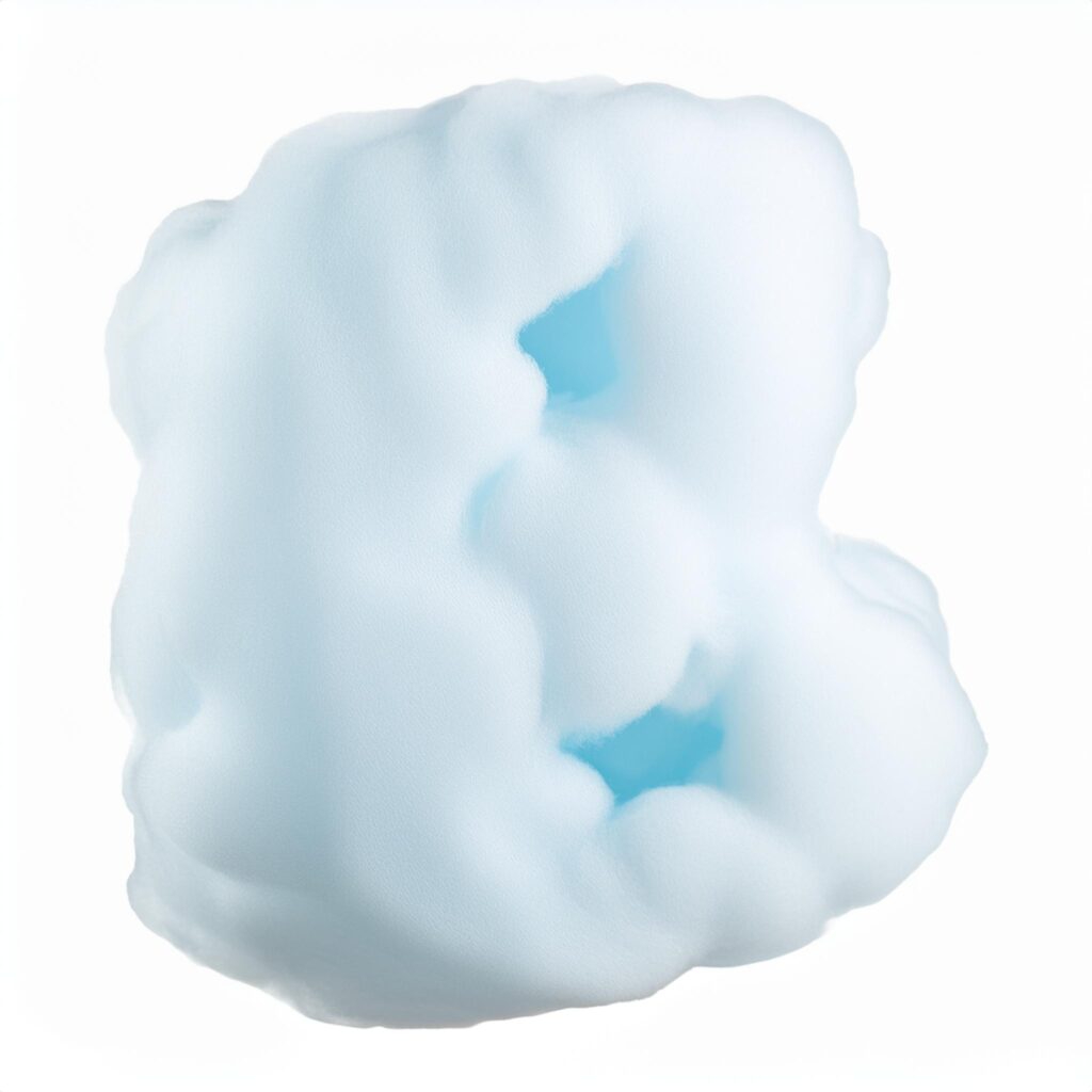
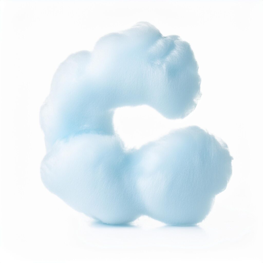
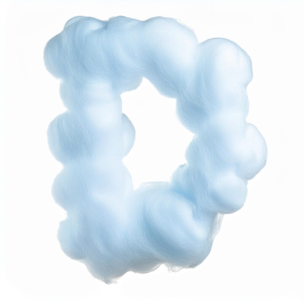
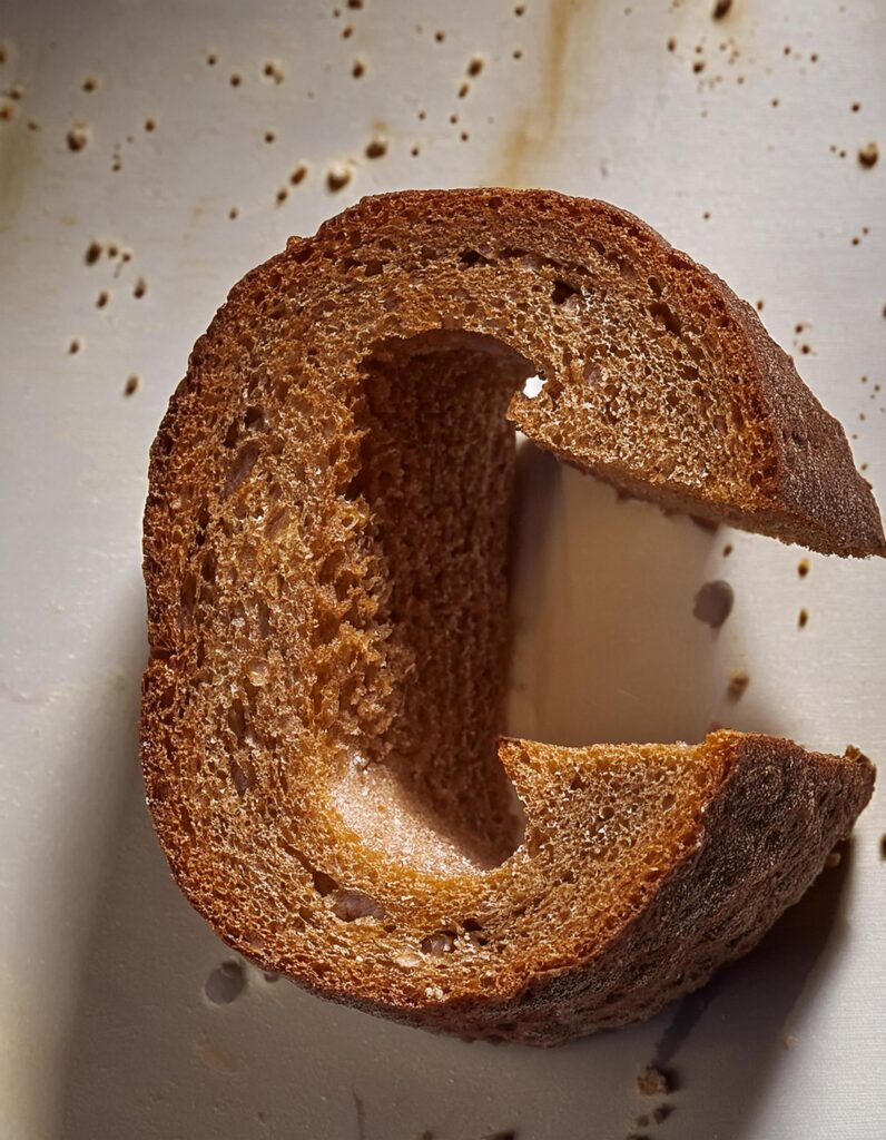
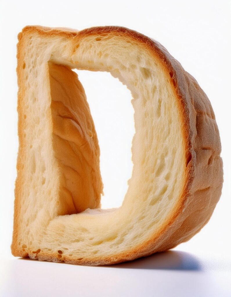
Inspo/What are we making:  There’s this social media challenge called “36 Days of Type.” It’s been around for a while but If you haven’t checked it out yet, definitely take a look at their Instagram—it’s packed with inspiration. There’s been an explosion of people making letters out of all kinds of things and after seeing what other designers have been doing with the daily letter challenges, experimenting with all kinds of effects, I decided I’d try this particular trend with Adobe Firefly (AF) (verses making things in midjourney, which is leaps and bounds above AF.)  I’m going to be crafting letters from everyday objects like ice cream and clouds! Inspired by the playful possibilities of typography, we’ll explore how to transform these random items into unique and imaginative letter forms.   

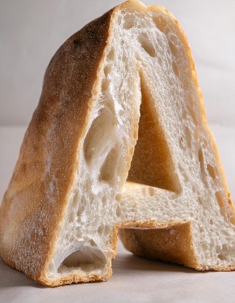
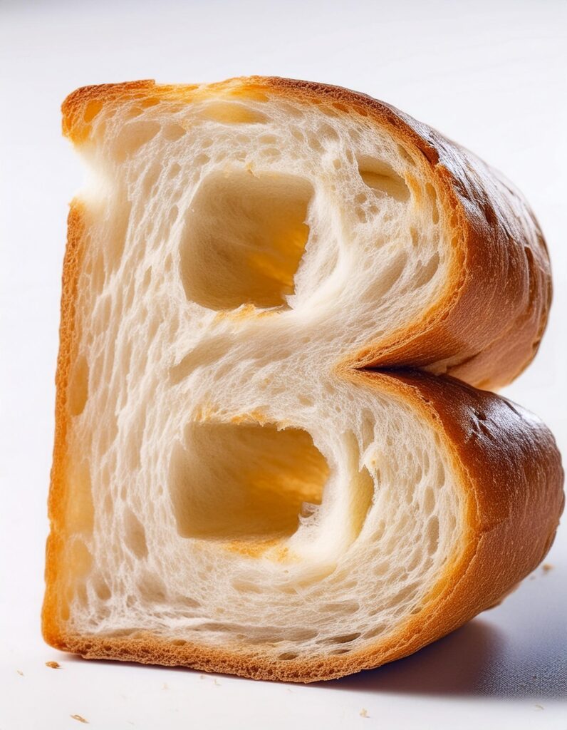
Because it’s summer and I’ve been at the beach, I decided I wanted to play around with making different letters out of different kinds of ice cream, banana, chocolate, strawberry, pistachio. The result below:

Here’s how to do it: 

  • Start with Adobe Firefly:

    • Open Adobe Firefly and navigate to the text-to-image tool.
    • Observe the different styles and compositions available. For photorealistic results, use the Photo content type.
  • Set Up Your Workspace:

    • Choose the 3:4 aspect ratio to give you ample room for your letter form.
    • Select the appropriate model (firefly 3) for generating images.
  • First thing you Want to Create is a Reference Image:

    • Begin by generating a reference image with a prompt like: “Strawberry ice cream scoop. Isolated studio lighting on a plain background. Pink ice cream ball.”
    • Review the options provided and select the one that closely matches your vision. If needed, use the “generate similar” feature or remix the image.
  • Refine the Reference Image:

    • Once satisfied with the reference image (strawberry ice cream ball image), download it and then use it for your style reference.
    • Use this image to guide the creation of additional variations if necessary. You might have to play with it a bit to get the result you’re looking for. 
    • I also played with different types of ice cream images just from google or unsplash. This part concerns me with using other people’s work – try to source rights free base imagery. For the ice cream text, I found that scoops and fruit cues produced the best effects in my final letters. 
  • Use Composition and Styles:

    • Styles: Upload your reference image of the ice cream you’ve just created.
    • Set your prompt to: “The letter A made out of pink strawberry ice cream. Floating, isolated on a white background. Studio lighting.” You’re gonna need to massage this and iterate on the images. 
    • Now, under composition upload a black/dark gray letter of the letter you are making. This acts as the container for the structure of the design. For my ice cream letters, I used Super Bubble font, which is free. I like the organic lines shape. Thicker fonts work much better. 
  • Generate and Finalize:

    • Once you have both the composition and the styles reference images loaded, you can play with the strength. I recommend using full strength for the composition to make sure the letter really comes through clearly. 
    • Use the reference image and prompt to generate the letter A. Review the results and download the most suitable one.
    • You may need to adjust or try different prompts to achieve the desired outcome.
    • For every letter, you’ll need to add another screenshot of the font from illustrator and also a new reference image. You can google and experiment with the types of imagery. For the ice cream, I aborted making my own and found that images where there was a scoop and a flavor cue worked the best.

Here's a few more letter styles I played with.

Followed the same steps here as I did for the ice cream. Created a reference image first off a mattress cube. Played around a few times with the images. Uploaded that mattress image to the styles and then uploaded a plain gray letter from illustrator with some 3D effects to give it depth. 

The cloud letters were challenging. I customized a font, se llama, “cloudy” and used the pencil tool to create some extra puffs on the letters. This style worked better with no bevel, just straight as you can see with the A vs. the D. These results were just meh. 

Bread prompt: the “letter C’ made out of bread, isolated on white plain background, studio lighting, hyper realistic * remember this is about the reference images. Try beveling/extruding your letters in illustrator for a more 3D look 

Here’s a few tutorials I found helpful: 

https://www.youtube.com/watch?v=W_lzD5rUF_k&t=43s


SHARE, LIKE, REPEAT

Get Connected