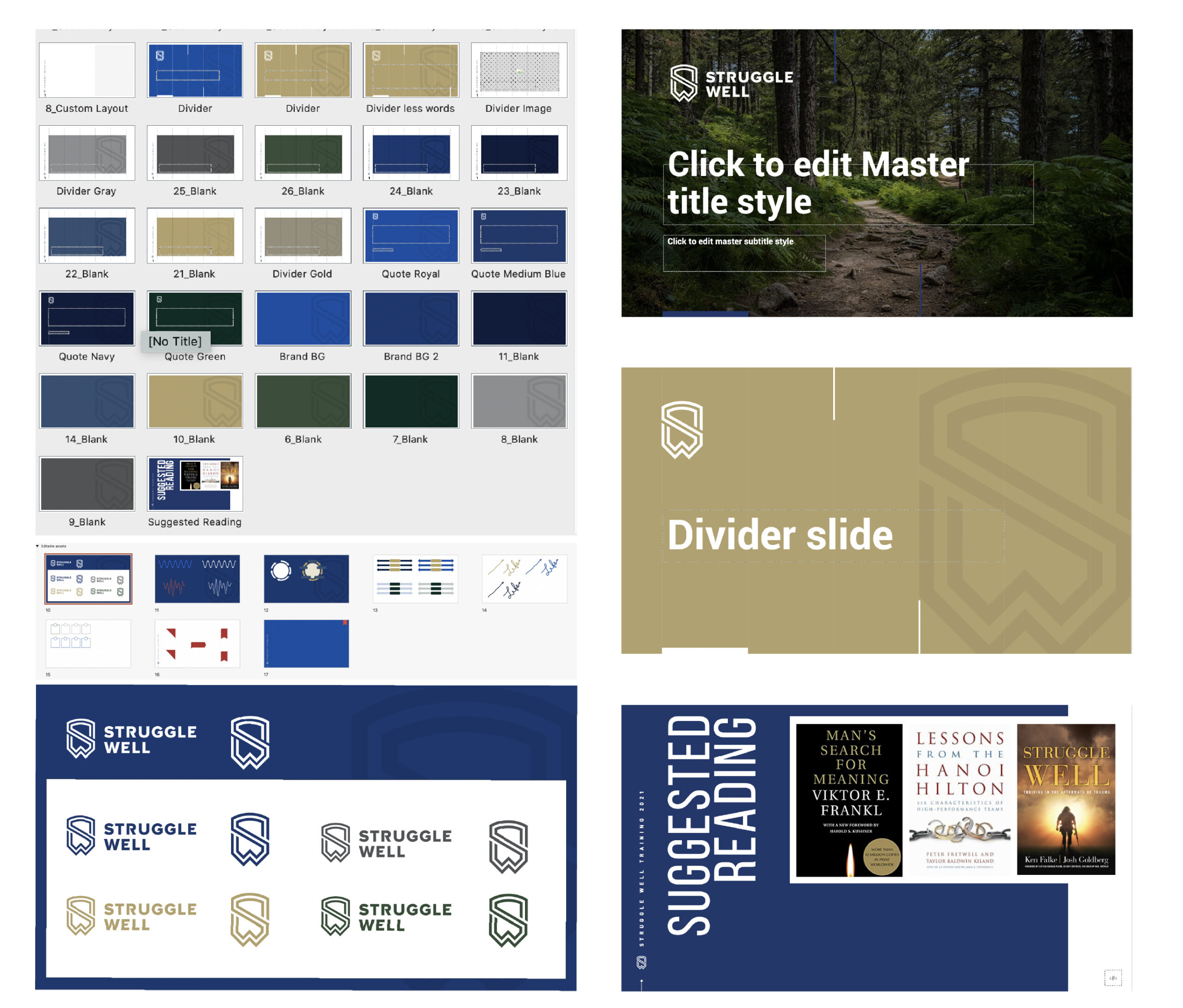
Art direction Branding: Color Palette Development, Typography Master PPTX
Challenge:
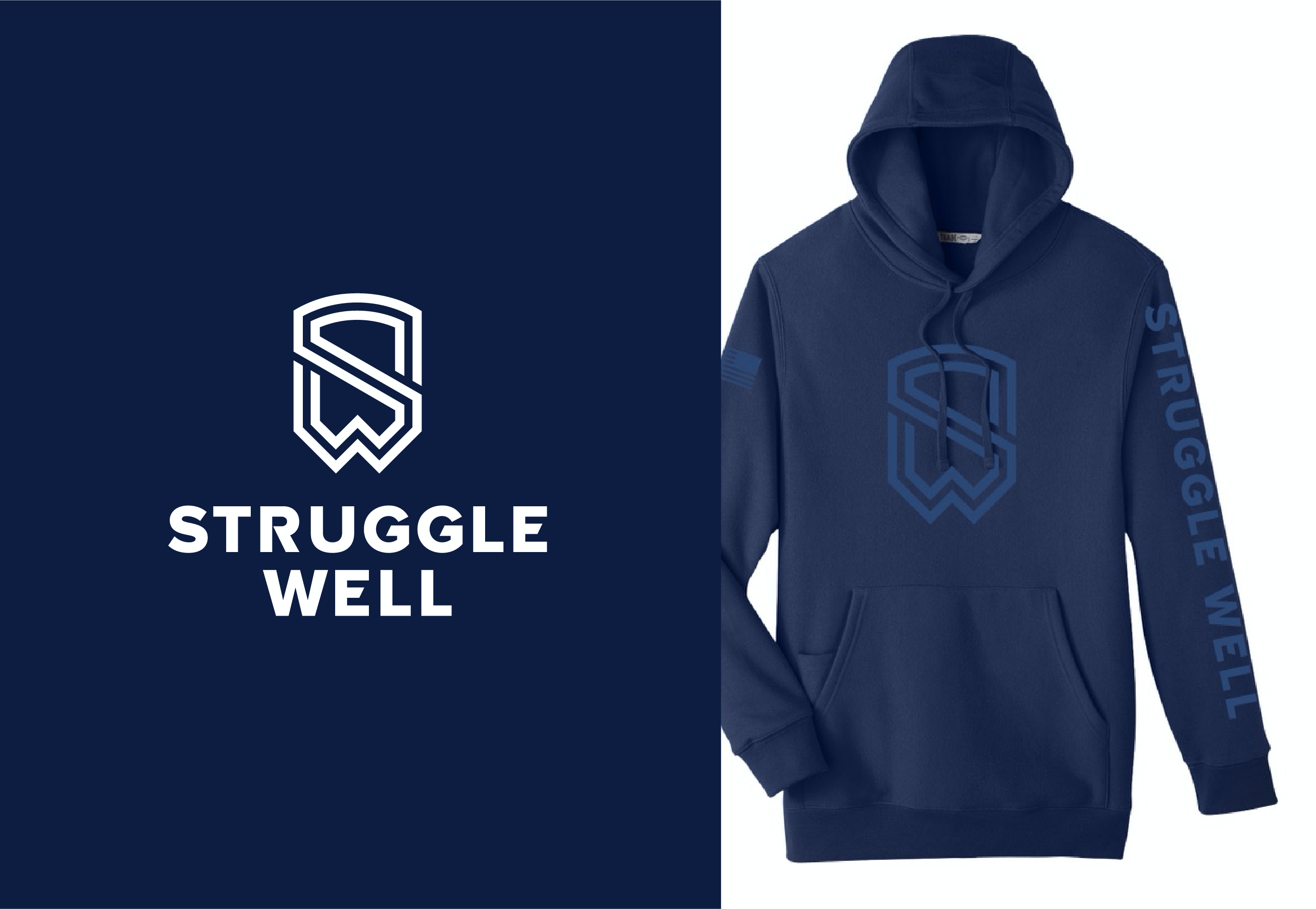
Boulder Crest Foundation is a non-profit organization helping veterans lead fulfilling lives in the aftermath of trauma. After nearly a decade of service, they gained tremendous insight into how people overcome times of deep challenge. They have been developing a consumer brand, Struggle Well, geared towards applying their learnings in within the civilian community. They wanted to separate distinguish these two branches more clearly.
I identified a freelancer, Alen, whose logo work embodied the strong lines and style BCF was looking to achieve.
https://dribbble.com/Type08
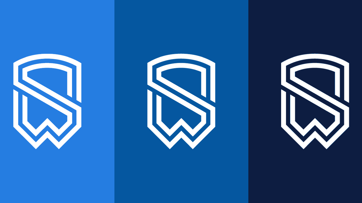
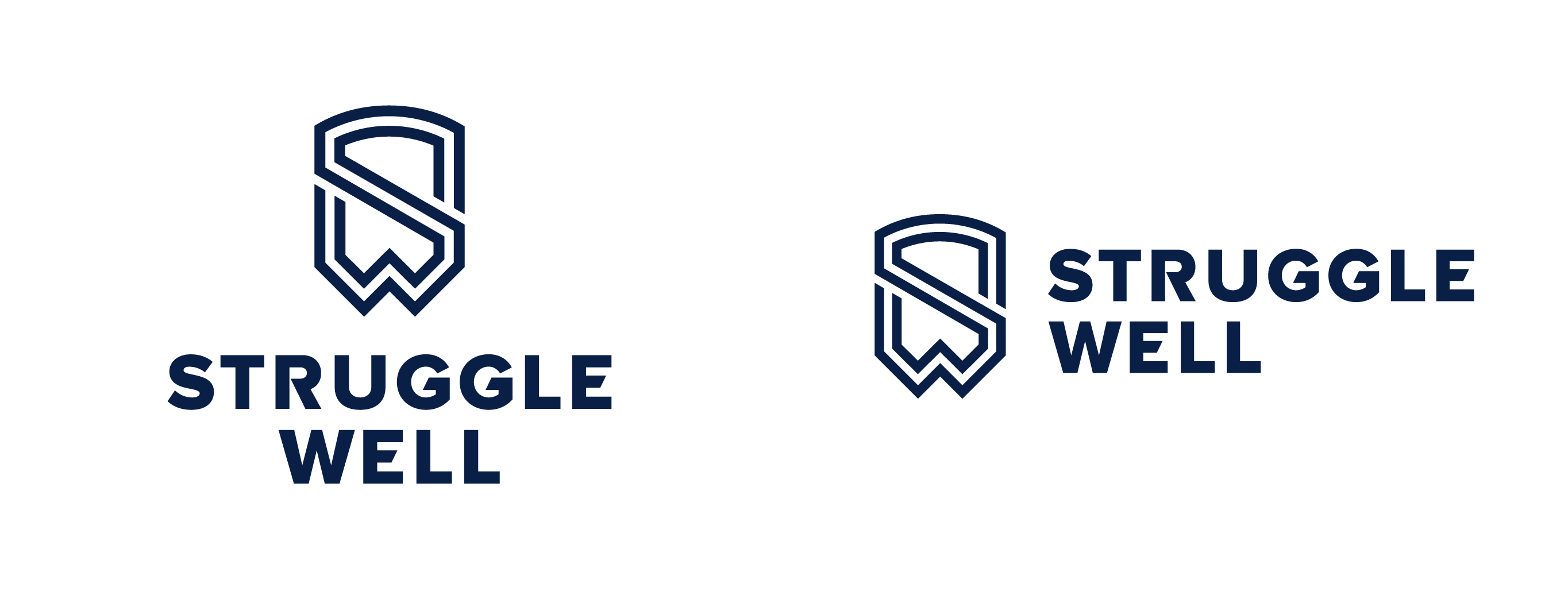
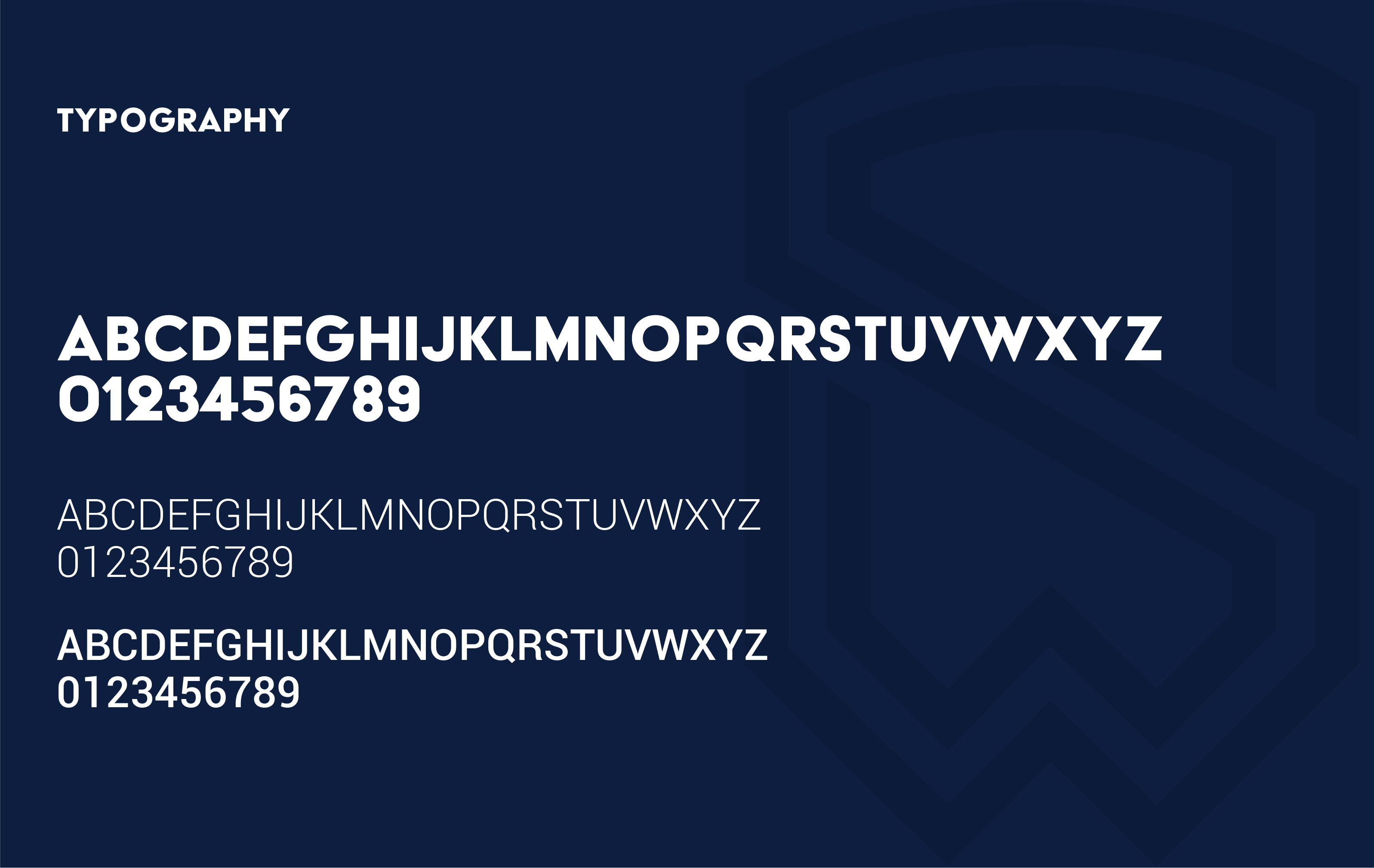
I created a palette that was harmonious and played well with the other side of the Struggle Well brand, whose dominate colors are yellow and black. I also selected ACIER, strong bold font with similar lines as the logo for headlines and roboto for the body copy.